Want to bring widgets to your SwiftUI app but not sure where to begin? This…
Slider, Stepper, and Toggle in SwiftUI

In this tutorial, we’ll dive into the essentials of using SwiftUI’s input controls—Slider, Stepper, and Toggle. These controls are fundamental for gathering numeric inputs and toggling settings in a user-friendly manner. By the end of this guide, you will know how to effectively implement these controls to improve user interaction within your SwiftUI applications.
Let’s develop a settings form for a hypothetical “Daily Water Intake Tracker” app. The form will allow users to set their daily water intake goal using a Slider, adjust notification frequency with a Stepper, and enable/disable motivational messages via a Toggle.
Explaining the Components
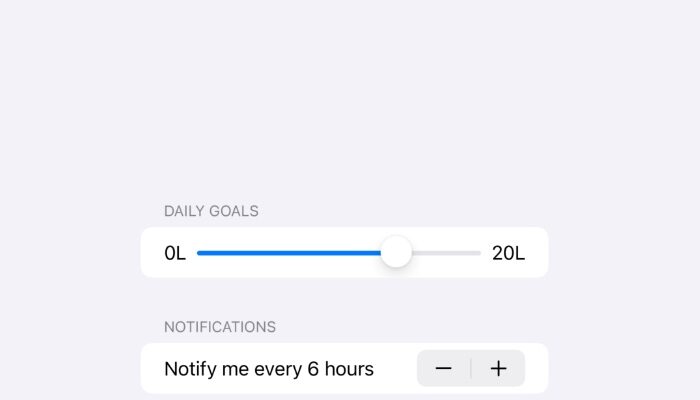
- Slider: Allows users to select a value within a defined range. We use it here to set the daily water intake goal, ranging from 0 to 20 liters.
- Stepper: Lets users increase or decrease a value. We utilize it to set how frequently the app should send notification reminders.
- Toggle: Provides a way to enable or disable a setting. In our form, it controls whether motivational messages are active.
import SwiftUI

struct SettingsView: View {
    @State private var dailyWaterIntake = 8.0
    @State private var notificationFrequency = 1
    @State private var motivationalMessagesEnabled = true

    var body: some View {
        NavigationView {
            Form {
                Section(header: Text("Daily Goals")) {
                    Slider(value: $dailyWaterIntake, in: 0...20, step: 0.5) {
                        Text("Daily Water Intake")
                    } minimumValueLabel: {
                        Text("0L")
                    } maximumValueLabel: {
                        Text("20L")
                    } onEditingChanged: { editing in
                        print("Slider value is now \(dailyWaterIntake)")
                    }
                }

                Section(header: Text("Notifications")) {
                    Stepper("Notify me every \(notificationFrequency) hours", value: $notificationFrequency, in: 1...12)
                }

                Section(header: Text("Messages")) {
                    Toggle("Motivational Messages", isOn: $motivationalMessagesEnabled)
                }
            }
            .navigationBarTitle("Settings")
        }
    }
}
Incorporating Sliders, Steppers, and Toggles into your SwiftUI apps can significantly enhance the interactivity and functionality of your forms. By following this tutorial, you’ve learned how to effectively implement these controls in a practical application scenario. Experiment with these elements to discover new ways to engage users and gather inputs in your iOS projects.


