In this comprehensive tutorial, we’ll guide you through the process of constructing a fully functional…
ColorPicker in SwiftUI
In this SwiftUI tutorial, we will explore the powerful ColorPicker component, which allows users to select colors within your app. We’ll create a “Dynamic Theme Editor” that lets users customize the look of a sample note-taking app. This will not only introduce you to the basic functionality of ColorPicker but also its integration with real-world app features.
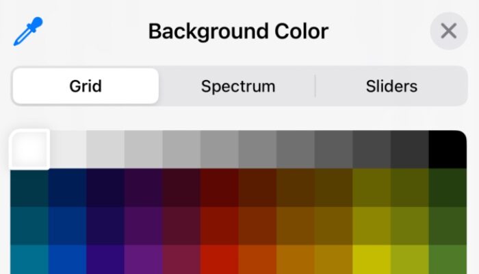
- ColorPicker: This component lets users choose a color. By binding it to state variables (
backgroundColorandtextColor), any changes made by the user are immediately reflected in the app’s UI. - Customization Options: While
ColorPickersupports opacity by default, you can disable it to simplify the color selection process.
import SwiftUI

struct ThemeEditorView: View {

@State private var backgroundColor = Color(.systemBackground)
    @State private var textColor = Color.primary

    var body: some View {

            Form {

                Section(header: Text("Customize Your Theme")) {

                    ColorPicker("Background Color", selection: $backgroundColor, supportsOpacity: true)
                        .padding()

                    ColorPicker("Text Color", selection: $textColor, supportsOpacity: false)
                        .padding()

                }
            }.scrollContentBackground(.hidden)
            .background(backgroundColor)
            .foregroundColor(textColor)

    }

}
Related Posts