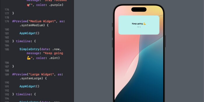
Want to bring widgets to your SwiftUI app but not sure where to begin? This…
TabView in SwiftUI

In app development, providing an intuitive navigation system is crucial for a good user experience. TabView in SwiftUI allows users to switch between different views or sections of an app at the tap of a tab. It’s commonly used for organizing high-level areas of an app, such as switching between different feature sets or data categories.
Why Use TabView?
- Intuitive UX: Users are familiar with tabbed navigation, making it easy to explore and switch between app sections.
- Organized Content: Helps in structuring your app’s content into distinct, easily navigable sections.
- Customizable: SwiftUI’s
TabViewoffers flexibility in appearance and functionality, fitting seamlessly into your app’s design.
Getting Started with TabView
Here’s a simple example of how to create a TabView with two tabs:
import SwiftUI

struct ContentView: View {
    var body: some View {
        TabView {
            Text("Home Tab")
                .tabItem {
                    Image(systemName: "house.fill")
                    Text("Home")
                }

            Text("Settings Tab")
                .tabItem {
                    Image(systemName: "gear")
                    Text("Settings")
                }
        }
    }
}
In this example, TabView contains two tabs: Home and Settings. Each tab is associated with a tabItem that specifies the tab’s icon and label.
Customizing TabView
SwiftUI’s TabView is highly customizable. Here’s how you can customize the tab selection and style:
Setting the Selected Tab Programmatically
You can control which tab is active by binding a state variable to the TabView‘s selection:
struct ContentView: View {
    @State private var selectedTab = 1

    var body: some View {
        TabView(selection: $selectedTab) {
            Text("First Tab")
                .tabItem {
                    Label("First", systemImage: "1.circle")
                }
                .tag(1) // Tag for identifying the tab

            Text("Second Tab")
                .tabItem {
                    Label("Second", systemImage: "2.circle")
                }
                .tag(2) // Tag for identifying the tab
        }
    }
}
Using .badge Modifier on a TabView
The .badge modifier in SwiftUI allows you to add contextual information to a view, such as a tab in a TabView or an item in a List, indicating new notifications or updates. This can be particularly useful for drawing attention to specific tabs that have new content or actions requiring user attention. Here’s a simple example demonstrating how to use the .badge modifier within a TabView:
struct ContentView: View {

    @State private var notificationsCount = 3

    var body: some View {
        TabView {
            Text("First Tab")
                .tabItem {
                    Label("Home", systemImage: "house")
                }

            Text("Second Tab")
                .tabItem {
                    Label("Settings", systemImage: "gear")
                }


            Text("Notifications Tab")
                .tabItem {
                    Label("Notifications", systemImage: "bell")
                }
                .badge(notificationsCount > 0 ? "\(notificationsCount)" : nil)
        }
    }
}
Other properties:
Use .toolbarBackground(color, for: .tabBar) to change tabView Background.
Use .toolbarBackground(.visible, for: .tabBar)
Use .tint(color) to set tint of the TabView
Conclusion
TabView in SwiftUI offers a straightforward yet powerful way to implement tabbed navigation in your apps. It not only enhances the organization of your app’s content but also provides an intuitive navigation experience for users. By following the examples provided in this guide, you can start incorporating TabView into your SwiftUI apps, customizing it to fit your design needs. Remember, the best way to master SwiftUI and its components like TabView is through practice and experimentation, so don’t hesitate to try out different configurations and see what works best for your app.


