Learn how to work with Xcode Previews in SwiftData App. SwiftData in combination with SwiftUI…
SwiftUI Button

Today, we’re focusing on one of the most versatile UI components: the Button. Perfect for beginners, this post will guide you through creating and styling buttons in SwiftUI in various exciting ways.
What is a SwiftUI Button?
In SwiftUI, a Button is a fundamental UI component used for handling user interactions. Buttons can trigger actions when tapped and can be customized to fit the style of your app.
Create a Button using Title String
Button("Click Me") {
    print("Button was tapped")
}
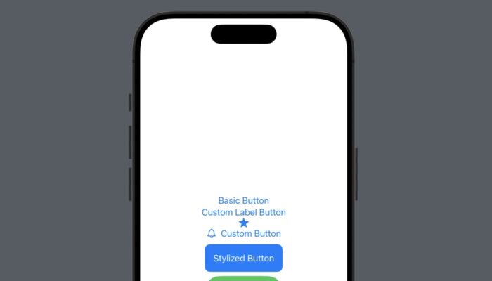
Create a Button using Label
  Button {
            print("Custom Label Button was tapped")
        } label: {
            Text("Custom Label Button")
        }
Create a Button using System Image
Button(action: {
    print("Button with Image tapped")
}) {
    Image(systemName: "star.fill")
}
Create a button with both text and an image.
Button(action: {
    print("Custom Button tapped")
}) {
    HStack {
        Image(systemName: "bell")
        Text("Notify Me")
    }
}
Stylize SwiftUI Button. Add custom styles to your buttons for a unique look.
Button("Stylized Button") {
    print("Stylish Button tapped")
}
.padding()
.background(Color.blue)
.foregroundColor(.white)
.cornerRadius(10)
Advanced: Creating a Reusable Custom Button Style
SwiftUI allows you to create reusable styles for your buttons.
struct CustomButtonStyle: ButtonStyle {
    func makeBody(configuration: Configuration) -> some View {
        configuration.label
            .padding()
            .background(Color.green)
            .foregroundColor(.white)
            .clipShape(Capsule())
            .scaleEffect(configuration.isPressed ? 0.95 : 1.0)
    }
}

// Usage
Button("Reusable Style") {
    print("Reusable style button tapped")
}
.buttonStyle(CustomButtonStyle())
Conclusion
Buttons in SwiftUI are not just functional; they are a canvas for creativity. Whether you’re using simple text buttons, incorporating system images, or designing custom styles, the possibilities are endless. Dive into SwiftUI and start crafting buttons that bring your app to life!


