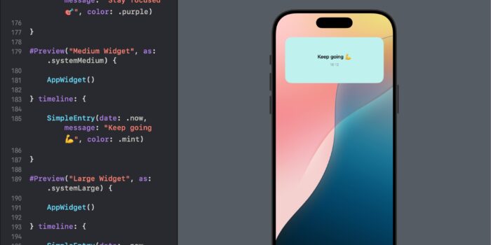
Want to bring widgets to your SwiftUI app but not sure where to begin? This…
SwiftUI Alert System Explained

SwiftUI simplifies the process of presenting alerts by providing a declarative syntax that integrates seamlessly with the state of your app. Through the use of the alert modifier, developers can present an alert with a customizable title, message, and a set of actions that the user can take.
SwiftUI Alert Example
In this example, we’ll create a ContentView that includes a button. When the button is tapped, an alert with a title and message will be displayed to the user. The alert will have two actions: “OK” to dismiss the alert and “Cancel” which also dismisses the alert but can be used to execute additional code if necessary.
import SwiftUI

struct ContentView: View {
    @State private var showAlert = false

    var body: some View {
        Button("Show Alert") {
            showAlert = true
        }
        .alert("Attention Needed", isPresented: $showAlert) {
            Button("OK") {
                print("OK tapped")
            }
            Button("Cancel", role: .cancel) {
                print("Cancel tapped")
            }
        } message: {
            Text("This is a simple alert in SwiftUI.")
        }
    }
}
In this ContentView, tapping the “Show Alert” button sets showAlert to true, triggering the presentation of the alert. The alert is configured with a title (“Attention Needed”) and a message (“This is a simple alert in SwiftUI.”). We define two buttons within the alert: “OK” and “Cancel”. The “Cancel” button is assigned the role of .cancel, making it the default cancellation action. When each button is tapped, a print statement is executed for demonstration purposes, but you could replace these print statements with any action you need to perform.
Simplified Alert Presentation in SwiftUI
SwiftUI makes it incredibly easy to present alerts to the user with minimal code. By leveraging the AlertItem struct, you can encapsulate all the details needed for an alert in a single, reusable component. Here’s how to implement a straightforward alert presentation triggered by a button tap:
Step 1: Define the AlertItem Structure
First, ensure you have the AlertItem structure defined. This struct will hold the title, message, and dismiss button for the alert, making it easy to reuse throughout your app:
import SwiftUI

struct AlertItem: Identifiable {
    let id = UUID()
    let title: Text
    let message: Text
    let dismissButton: Alert.Button
}
Step 2: Integrate the Alert with a Button
In this simplified example, we’ll create a ContentView that includes a button. Pressing the button will trigger an alert without any additional user input or state:
struct ContentView: View {
    @State private var alertItem: AlertItem?

    var body: some View {
        Button("Tap to Show Alert") {
            // Configure the alert item to display an alert
            alertItem = AlertItem(title: Text("Simple Alert"),
                                  message: Text("This is how you show a simple alert in SwiftUI."),
                                  dismissButton: .default(Text("OK")))
        }
        .alert(item: $alertItem) { item in
            Alert(title: item.title, message: item.message, dismissButton: item.dismissButton)
        }
    }
}

struct ContentView_Previews: PreviewProvider {
    static var previews: some View {
        ContentView()
    }
}
Understanding the Simplified Example
In this streamlined example, the ContentView contains just a button that, when tapped, initializes the alertItem with the necessary details for the alert presentation. The .alert(item:) modifier listens for changes to the alertItem. Once alertItem is set, the alert is presented to the user with the specified title, message, and a button to dismiss the alert.
This approach is perfect for beginners and offers a clear illustration of the power and simplicity of SwiftUI for managing UI components like alerts. It demonstrates how to present an alert with just a few lines of code, focusing on the essence of alert presentation in SwiftUI.
Selecting a Favorite Book with SwiftUI Alerts
First, we define a simple Book struct that uniquely identifies each book by its title:
struct Book: Identifiable {
    var id: String { title }
    let title: String
}
Next, we implement ContentView, where users can select their favorite book. This view demonstrates how to use the .alert(item:) modifier with the Book model:
struct ContentView: View {

    @State private var selectedBook: Book?

    var body: some View {
        VStack() {

            Spacer()

            Text("\(selectedBook?.title ?? "Select the Book")")

            Spacer()

            Button(" 1984") {
                selectedBook = Book(title: "1984")
            }

            Button("Select The Great Gatsby") {
                selectedBook = Book(title: "The Great Gatsby")
            }

            Spacer()

        }
        .alert(item: $selectedBook) { book in
            Alert(title: Text(book.title),
                  message: Text("An excellent selection!"),
                  dismissButton: .default(Text("Close")))
        }
    }

}
In this example, the ContentView consists of two buttons, each representing a classic novel. Upon tapping a button, the corresponding Book instance is assigned to selectedBook, triggering an alert that displays the selected book’s title and a custom message.
Notice, that when the alert is dismissed, the binding used in item: ($selectedBook) is set to nil. This is the expected behavior as it signifies the alert has been handled and dismissed.
To keep the selectedBook selection even after the alert is dismissed, let’s introduce a workaround. One approach is to use a separate state to control the alert’s visibility, instead of tying the alert presentation directly to whether selectedBook is nil or not. Let’s adjust the code.
struct ContentView: View {

        @State private var selectedBook: Book?
        @State private var showAlert = false // A new state variable to control the alert's visibility

        var body: some View {
            VStack() {

                Spacer()

                Text("\(selectedBook?.title ?? "Select the Book")")

                Spacer()

                Button("1984") {
                    selectedBook = Book(title: "1984")
                    showAlert = true // Show the alert
                }

                Button("Select The Great Gatsby") {
                    selectedBook = Book(title: "The Great Gatsby")
                    showAlert = true // Show the alert
                }

                Spacer()

            }
            .alert(isPresented: $showAlert) { // Use `isPresented` instead of `item`
                guard let selectedBook = selectedBook else { return Alert(title: Text("No Book Selected")) }
                return Alert(
                    title: Text(selectedBook.title),
                    message: Text("An excellent selection!"),
                    dismissButton: .default(Text("Close"))
                )
            }
        }

}


