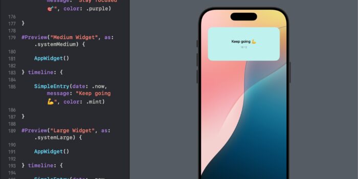
Want to bring widgets to your SwiftUI app but not sure where to begin? This…
Picker and PaletteSelectionEffect in SwiftUI

SwiftUI provides powerful tools for building intuitive and visually appealing user interfaces. Two such tools are the Picker and PaletteSelectionEffect, which when combined, offer a sophisticated method for displaying selectable options in a more engaging way. This tutorial will walk you through integrating these features to create a dynamic selection interface.
Introduction to Key Components
- Picker: A SwiftUI component that allows users to choose from a set of options.
- PaletteSelectionEffect: A modifier that applies special visual effects to selections within a picker, enhancing the overall aesthetic and making the active selection stand out.
Color Picker in SwiftUI Tutorial
We will design a color picker that lets users choose from a set of basic colors. Each color will be represented visually, and the picker will display the name of the selected color. This is particularly useful in applications where users might want to customize the color themes of various UI elements.
import SwiftUI

struct ColorPickerView: View {
    private let colors: [Color] = [.red, .green, .blue, .yellow, .purple, .orange]
    private let colorNames: [String] = ["Red", "Green", "Blue", "Yellow", "Purple", "Orange"]

    @State private var selectedColorIndex = 0

    var body: some View {
        VStack {
            Text("Select a color:")
                .font(.headline)
                .padding()

            Picker("Colors", selection: $selectedColorIndex) {
                ForEach(colors.indices, id: \.self) { index in
                    HStack {
                        Text(colorNames[index])
                            .foregroundColor(colors[index])
                            .padding()
                    }
                    .tag(index)
                }
            }
            .pickerStyle(.wheel)
            .padding()

            Text("You selected: \(colorNames[selectedColorIndex])")
                .font(.title2)
                .foregroundColor(colors[selectedColorIndex])
                .fontWeight(.medium)
                .padding()
        }
        .padding()
    }
}
This color picker example is tailored for applications requiring user customization, offering an easy-to-use interface for choosing visually appealing colors. The example uses basic SwiftUI components to create a functional and interactive picker.
Palette Selection Effect Tutorial
This part of the tutorial will explore how to utilize the PaletteSelectionEffect in SwiftUI, enhancing the visual response of items in a picker when they are selected. This feature is particularly useful in providing immediate visual feedback in UIs where choices can be previewed through distinct visual changes.
Example: Customizing Selection Effects in a Color Palette
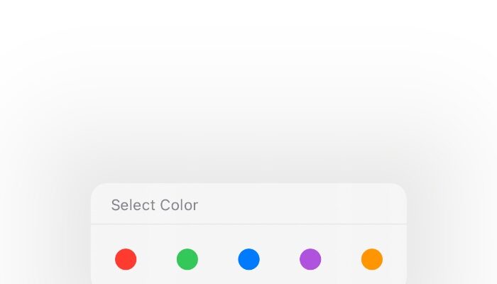
We will create a dynamic color palette where users can tap to select a color. The selection will be visually enhanced using the PaletteSelectionEffect to make the selected color stand out more prominently.
n SwiftUI, the .paletteSelectionEffect modifier allows you to customize the visual effect applied to items in a palette-style picker. Alongside .symbolVariant(.fill), there are a couple of other options you can use to tailor the appearance of selected items:
.automatic:- This is the default selection effect provided by the system. It applies an automatic styling based on the context and the type of content. For instance, it might apply a subtle background color change, an outline, or an underline to indicate selection.
.custom:- This effect allows for full customization of the selection appearance. You can explicitly define how selected items should look without relying on the system’s default styles. This is typically used when you want to apply specific graphics or visual elements that indicate selection, such as changing the image or applying custom views.
.symbolVariant(_:):- This option applies a specific variant of the provided SF Symbols. The
.symbolVariantcan take different parameters like.fill,.slash,.circle, etc., to apply different visual styles to the symbol based on its selection state. For example,.symbolVariant(.slash)would replace the symbol with its slashed version when selected, if available.
- This option applies a specific variant of the provided SF Symbols. The
These options give you a range of possibilities for customizing how selections are displayed in a Picker with a palette style, allowing for both subtle system-integrated effects and entirely custom visuals.
struct ColorPalettePicker: View {
    enum ColorTag: String, CaseIterable, Identifiable {
        case red, green, blue, purple, orange

        var color: Color {
            switch self {
            case .red:
                return .red
            case .green:
                return .green
            case .blue:
                return .blue
            case .purple:
                return .purple
            case .orange:
                return .orange
            }
        }

        var id: String { self.rawValue }
    }

    @State private var selectedColor: ColorTag = .red

    var body: some View {
        Menu {
            Picker("Select Color", selection: $selectedColor) {
                ForEach(ColorTag.allCases) { tag in
                    Image(systemName: "circle.fill")
                        .tint(tag.color)
                        .tag(tag)
                }
            }
            .pickerStyle(.palette)
            .paletteSelectionEffect(.custom)
            // Applying custom selection effect
        } label: {
            Label("Color Options", systemImage: "paintpalette")
                .foregroundColor(selectedColor.color)
        }
    }
}
In conclusion, our tutorial on implementing a color palette picker in SwiftUI demonstrates a sleek and user-friendly approach to enabling users to select from predefined color options. By utilizing the Picker view with a .palette style and customizing the selection effects using .paletteSelectionEffect(.custom), we’ve created a visually appealing interface that enhances the user experience. The ColorPalettePicker view elegantly showcases a menu-driven color selection, where users can easily switch between colors, which then dynamically update the menu’s appearance. This example not only underscores the versatility of SwiftUI’s UI components but also illustrates how effectively they can be tailored to meet specific design requirements, making it an ideal choice for developers looking to enhance interactivity and aesthetic appeal in their apps.


