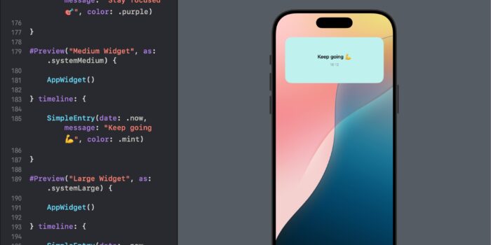
Want to bring widgets to your SwiftUI app but not sure where to begin? This…
Image in SwiftUI

SwiftUI provides an easy way for adding and manipulating images in your apps. This tutorial will guide you through the basics of using images in SwiftUI, with unique and interesting examples that cater to developers of all levels.
Introduction to Image in SwiftUI
The Image view in SwiftUI displays an image and provides various initializers and modifiers to customize its appearance. You can create images from different sources, such as asset catalogs, UIImage or NSImage instances, and SF Symbols.
Creating a Basic Image
Let’s start with a simple example of displaying an image from the app’s asset library.
import SwiftUI

struct ContentView: View {
    var body: some View {
        Image("exampleImage") // Replace "exampleImage" with your image name
            .resizable()
            .aspectRatio(contentMode: .fit)
            .padding()
    }
}
In this example, the image is loaded from the asset catalog, made resizable, and its aspect ratio is maintained to fit within its container.
Customizing Image Views
SwiftUI provides several modifiers to customize how images are displayed. Here are some useful modifiers and how to use them:
Resizing and Scaling Images
You can resize and scale images to fit or fill a given space while maintaining their aspect ratio.
import SwiftUI

struct ResizableImageView: View {
    var body: some View {
        VStack {
            Image("exampleImage")
                .resizable()
                .scaledToFit()
                .frame(width: 200, height: 200)
                .border(Color.green, width: 1)

            Image("exampleImage")
                .resizable()
                .scaledToFill()
                .frame(width: 300, height: 200)
                .clipped()
                .border(Color.gray, width: 10)
        }
    }
}
Applying Shapes and Borders
You can apply various shapes and borders to your images to make them more visually appealing.
import SwiftUI

struct ShapedImageView: View {
    var body: some View {
        VStack {
            Image("exampleImage")
                .resizable()
                .clipShape(Circle())
                .overlay(Circle().stroke(Color.white, lineWidth: 4))
                .shadow(radius: 10)
                .padding()

            Image("exampleImage")
                .resizable()
                .clipShape(RoundedRectangle(cornerRadius: 25))
                .overlay(RoundedRectangle(cornerRadius: 25).stroke(Color.white, lineWidth: 4))
                .shadow(radius: 10)
                .padding()
        }
    }
}
Applying Color Adjustments to Image in SwiftUI
import SwiftUI

struct ColorAdjustmentImageView: View {
    var body: some View {
        VStack {
            Image("exampleImage")
                .resizable()
                .scaledToFit()
                .brightness(0.2) // Increases the brightness of the image
                .contrast(1.5) // Increases the contrast of the image
                .saturation(1.2) // Increases the saturation of the image
                .frame(width: 300, height: 200)
                .padding()
        }
    }
}
Applying Blend Mode
The blendMode modifier allows you to apply different blending effects to images, combining them with their background or other views.
import SwiftUI

struct BlendModeImageView: View {
    var body: some View {
        VStack {
            Image("exampleImage")
                .resizable()
                .scaledToFit()
                .blendMode(.multiply) // Applies multiply blend mode to the image
                .frame(width: 300, height: 200)
                .background(Color.yellow) // Background color to blend with the image
                .padding()
        }
    }
}
Rotating and Scaling Images
You can use the rotationEffect and scaleEffect modifiers to rotate and scale images in SwiftUI.
import SwiftUI

struct RotateAndScaleImageView: View {
    var body: some View {
        VStack {
            Image("exampleImage")
                .resizable()
                .scaledToFit()
                .rotationEffect(.degrees(45)) // Rotates the image by 45 degrees
                .scaleEffect(1.5) // Scales the image by 1.5 times
                .frame(width: 300, height: 200)
                .padding()
        }
    }
}
Using SF Symbols
SF Symbols are a set of over 2,400 configurable symbols that you can use in your SwiftUI apps. Here’s how to use them:
import SwiftUI

struct SFSymbolsView: View {
    var body: some View {
        VStack {
            Image(systemName: "star.fill")
                .font(.largeTitle)
                .foregroundColor(.yellow)

            Image(systemName: "heart.fill")
                .font(.system(size: 50))
                .foregroundColor(.red)
        }
    }
}
Creating a Custom Image with Drawing Instructions
SwiftUI also allows you to create custom images using drawing instructions. Here’s a simple example:
import SwiftUI

struct CustomDrawingImageView: View {
    var body: some View {
        Image(uiImage: drawCustomImage())
            .resizable()
            .scaledToFit()
            .frame(width: 200, height: 200)
    }

    func drawCustomImage() -> UIImage {
        let renderer = UIGraphicsImageRenderer(size: CGSize(width: 200, height: 200))
        return renderer.image { context in
            let cgContext = context.cgContext
            cgContext.setFillColor(UIColor.blue.cgColor)
            cgContext.fill(CGRect(x: 0, y: 0, width: 200, height: 200))
            cgContext.setFillColor(UIColor.white.cgColor)
            cgContext.setStrokeColor(UIColor.red.cgColor)
            cgContext.setLineWidth(10)
            cgContext.addEllipse(in: CGRect(x: 50, y: 50, width: 100, height: 100))
            cgContext.drawPath(using: .fillStroke)
        }
    }
}
Conclusion
SwiftUI’s Image view is a versatile and powerful tool for displaying and customizing images in your apps. By using various initializers and modifiers, you can create a wide range of image views that are responsive, visually appealing, and accessible.


