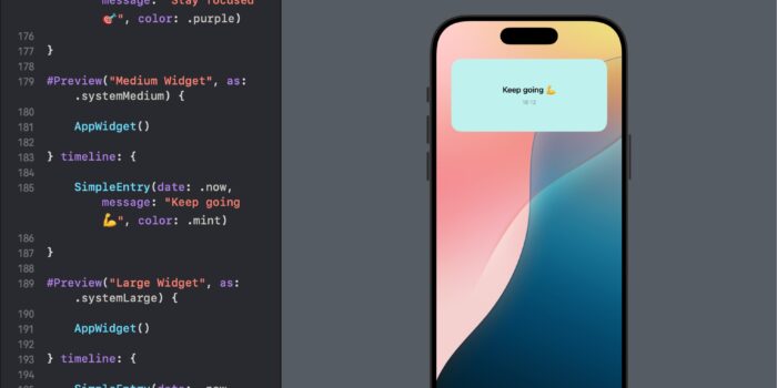
Want to bring widgets to your SwiftUI app but not sure where to begin? This…
DatePicker in SwiftUI

A DatePicker in SwiftUI is a control that binds to a Date instance, allowing users to pick a calendar date or a time from a visually intuitive interface. It’s an essential tool for applications that require date inputs such as event planners, booking systems, or any form setup.
Basic Example of DatePicker
Let’s explore a basic example of a DatePicker tailored for an app where users can select their birthdate. This example focuses on selecting the date only, without including time.
import SwiftUI

struct ContentView: View {
    @State private var birthDate = Date()

    var body: some View {
        DatePicker(
            "Select Your Birthdate",
            selection: $birthDate,
            displayedComponents: [.date]
        )
    }
}
In this example, the DatePicker is initialized with a label “Select Your Birthdate”. The user interacts with this label to bring up a calendar view, from which a date can be chosen. This setup binds to the birthDate state variable, ensuring the selected date is stored and can be used elsewhere in the app.
Date Range Limitation
Apps often need to restrict the date selection to specific ranges. For instance, a promotional campaign app might want users to select dates within a particular year. Here’s how you can limit the DatePicker to allow date selections only within the year 2024:
import SwiftUI

struct SwiftUIDatePicker_Range: View {

    @State private var campaignDate = Date()

    let yearRange: ClosedRange = {
        let calendar = Calendar.current
        let startComponents = DateComponents(year: 2024, month: 1, day: 1)
        let endComponents = DateComponents(year: 2024, month: 12, day: 31)
        return calendar.date(from: startComponents)! ...
               calendar.date(from: endComponents)!
    }()

    var body: some View {
        DatePicker(
            "Campaign Date",
            selection: $campaignDate,
            in: yearRange,
            displayedComponents: [.date]
        )
    }

}
This snippet ensures that users can only select dates within the year 2024, thus enforcing the campaign’s temporal boundaries effectively.
Customizing DatePicker Style
SwiftUI allows for customization of the DatePicker through the .datePickerStyle() modifier. For example, if you prefer a wheel-style date picker over the default style, you can modify the DatePicker as follows:
import SwiftUI

struct ContentView: View {
    @State private var appointmentDate = Date()

    var body: some View {
        DatePicker(
            "Select Appointment Date",
            selection: $appointmentDate,
            displayedComponents: [.date]
        )
        .datePickerStyle(WheelDatePickerStyle())
    }
}
In this configuration, the DatePicker will appear with a spinning wheel interface, which might be preferable for certain aesthetics or usability preferences.
Conclusion
The DatePicker component in SwiftUI is a robust and versatile UI element that can significantly enhance the user experience in applications requiring date inputs. By understanding and utilizing its customization options, developers can effectively cater to the specific needs of their applications and their users.


