Want to bring widgets to your SwiftUI app but not sure where to begin? This…
ColorPicker in SwiftUI
In this SwiftUI tutorial, we will explore the powerful ColorPicker component, which allows users to select colors within your app. We’ll create a “Dynamic Theme Editor” that lets users customize the look of a sample note-taking app. This will not only introduce you to the basic functionality of ColorPicker but also its integration with real-world app features.
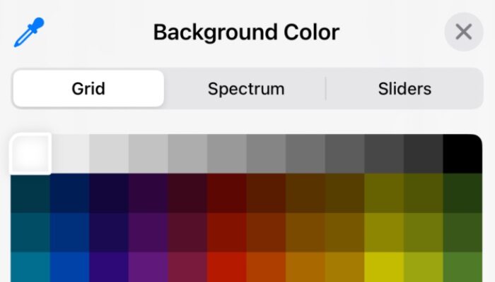
- ColorPicker: This component lets users choose a color. By binding it to state variables (
backgroundColorandtextColor), any changes made by the user are immediately reflected in the app’s UI. - Customization Options: While
ColorPickersupports opacity by default, you can disable it to simplify the color selection process.
import SwiftUI

struct ThemeEditorView: View {

@State private var backgroundColor = Color(.systemBackground)
    @State private var textColor = Color.primary

    var body: some View {

            Form {

                Section(header: Text("Customize Your Theme")) {

                    ColorPicker("Background Color", selection: $backgroundColor, supportsOpacity: true)
                        .padding()

                    ColorPicker("Text Color", selection: $textColor, supportsOpacity: false)
                        .padding()

                }
            }.scrollContentBackground(.hidden)
            .background(backgroundColor)
            .foregroundColor(textColor)

    }

}
Related Posts